How to Create a Hexagon Shape in CSS — Tutorial with Code
Published on · Tagged with shapes-with-css art
ℹ️ This article is part of our series on Creating shapes with CSS
Web design is no longer confined to simple squares and circles; today's developers are constantly pushing the boundaries of what's possible with CSS. One often overlooked yet powerful capability of CSS is the ability to create complex shapes, like hexagons. Hexagons can be an engaging addition to a design, breaking up the monotony of rectangular layouts. But how do you go about creating a hexagon in CSS?
In this blog post, we'll delve into two different approaches to creating a hexagon using CSS: first, we will use pseudo-elements to create a hexagon from scratch, then we'll explore the powerful clip-path property to quickly and efficiently construct our shape. Let's get started on our journey towards mastering the art of creating hexagons in CSS!
Using Pseudo-Elements #
Pseudo-elements are a powerful feature of CSS that allow you to style specific parts of an element without the need to add additional HTML markup. Pseudo-elements act as virtual elements that can be targeted and styled using CSS selectors.
There are several commonly used pseudo-elements in CSS but we will only cover two pseudo-elements in this article.
- ::before: This pseudo-element is used to insert content before the selected element. It is often used to add decorative elements or icons before a text or an element.
- ::after: Similar to
::before, the::afterpseudo-element is used to insert content after the selected element. It can be used for adding additional content or decorative elements.
Read this great post on web.dev that explains pseudo-elements in depth with examples. Before creating Hexagon, lets first understand how to create a simple triangle.
Creating a triangle 🔺 #
Creating a triangle doesn’t require pseudo-elements but manipulation of borders and this concept will used in creating hexagon later. Here’s a simple HTML+CSS code for generating triangle using pseudo-elements 👇
<style>
.triangle {
  width: 0;
  height: 0;
  border-left: 50px solid transparent;  /* Left border width */
  border-right: 50px solid transparent; /* Right border width */
  border-bottom: 100px solid red;       /* Bottom border width, also color of the triangle */
}
</style>

<div class="triangle"></div>
In this example, the .triangle class will create a red upward-pointing triangle. The "width" and "height" are set to zero, and the borders are manipulated to create the triangle shape. The border-bottom property determines the color of the triangle.
You can create triangles pointing in different directions by altering which border is colored and which borders are transparent:
- Upward triangle: Color the bottom border
- Downward triangle: Color the top border
- Leftward triangle: Color the right border
- Rightward triangle: Color the left border
Creating a Hexagon 🔯 #
Once you understand, how a triangle is created by setting height & width to 0 and then manipulating borders.
Lets create a simple rectangle first - for which we need to define its height & width. Here’s how I calculated the values 👇
Each Angle in Hexagon = ((N-2)*180)/6 = 720/6 = 120
Width of the rectangle = 2 x Sin60˚ x Side of Hexagon
Width of rectangle = 2 x √3/2 x Side of Hexagon
Width of Rectangle = √3 x Side of Hexagon
To make things simple, I took Side of Hexagon as 100√3 = 173.20px so that we can get width of rectangle as 300px and height of rectangle becomes same as side of hexagon which is 173.20px.
<div class="hexagon"></div>
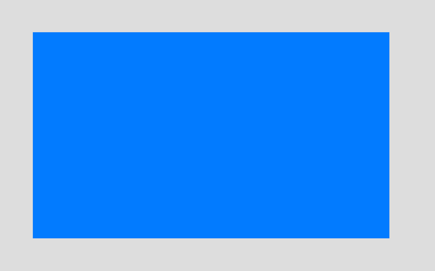
.hexagon {
position: relative;
width: 300px;
height: 173.2px;
background-color: #007BFF;
margin: 86.6px 0;
}With above code, we get an output like this:
Now, we will leverage pseudo-elements ::before and ::after to create an upward triangle and a downward triangle to this rectangle.
Lets’s add an upward triangle
.hexagon::before {
  content: "";
  position: absolute;
  width: 0;
  border-left: 150px solid transparent;
  border-right: 150px solid transparent;
  bottom: 100%;
  border-bottom: 86.6px solid #007BFF;
}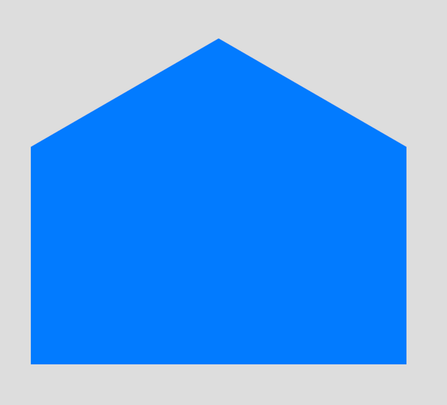
Let’s add a downward triangle and completing the final hexagon.
.hexagon::after {
  content: "";
  position: absolute;
  width: 0;
  border-left: 150px solid transparent;
  border-right: 150px solid transparent;
  top: 100%;
  width: 0;
  border-top: 86.6px solid #007BFF;
}
Here's how the complete code will look like:
<div class="hexagon"></div>

.hexagon {
  position: relative;
  width: 300px;
  height: 173.2px;
  background-color: #007BFF;
  margin: 86.6px 0;
}

.hexagon::before {
  content: "";
  position: absolute;
  width: 0;
  border-left: 150px solid transparent;
  border-right: 150px solid transparent;
  bottom: 100%;
  border-bottom: 86.6px solid #007BFF;
}

.hexagon::after {
  content: "";
  position: absolute;
  width: 0;
  border-left: 150px solid transparent;
  border-right: 150px solid transparent;
  top: 100%;
  width: 0;
  border-top: 86.6px solid #007BFF;
}
This completes our final figure and we have successfully created a hexagon in CSS using borders and pseudo-elements.
Here’s a link to JSBin - https://jsbin.com/kigedikiku/edit?html,css,output
Using clip-path #
The clip-path property in CSS, is a powerful feature that lets you clip an element into various shapes. It has changed the way we approach web design. Moving beyond the traditional rectangular box model, clip-path unlocks a plethora of design possibilities, enabling developers to craft everything from simple geometric shapes to intricate SVG figures.
clip-path property can take values like inset(), circle(), ellipse() & polygon(). Refer to this article on web.dev to learn more about clip-path. In this article, we will use polygon() to create our hexagon.
With clip-path, triangle, hexagon, octagon everything will sound really easy.
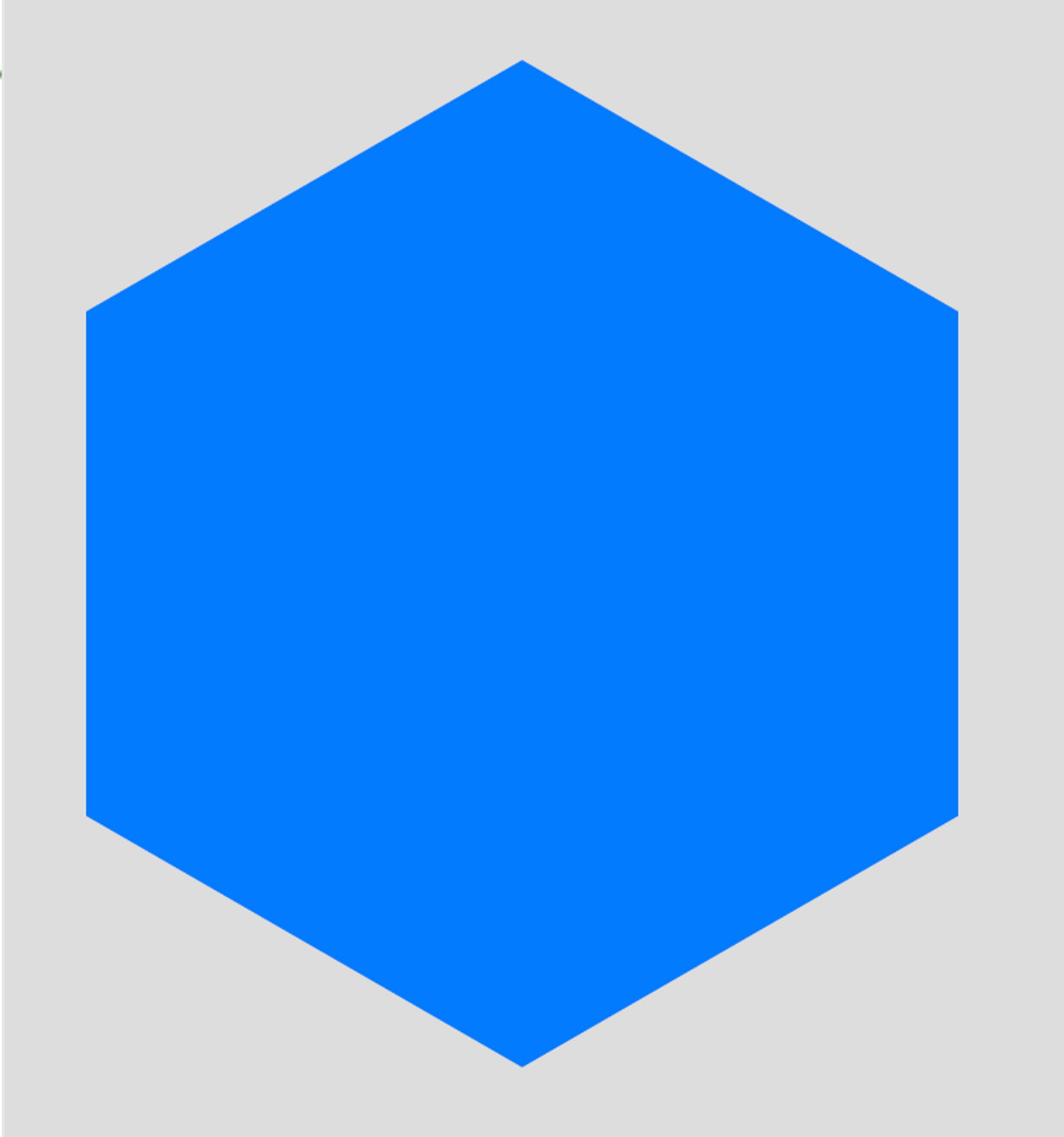
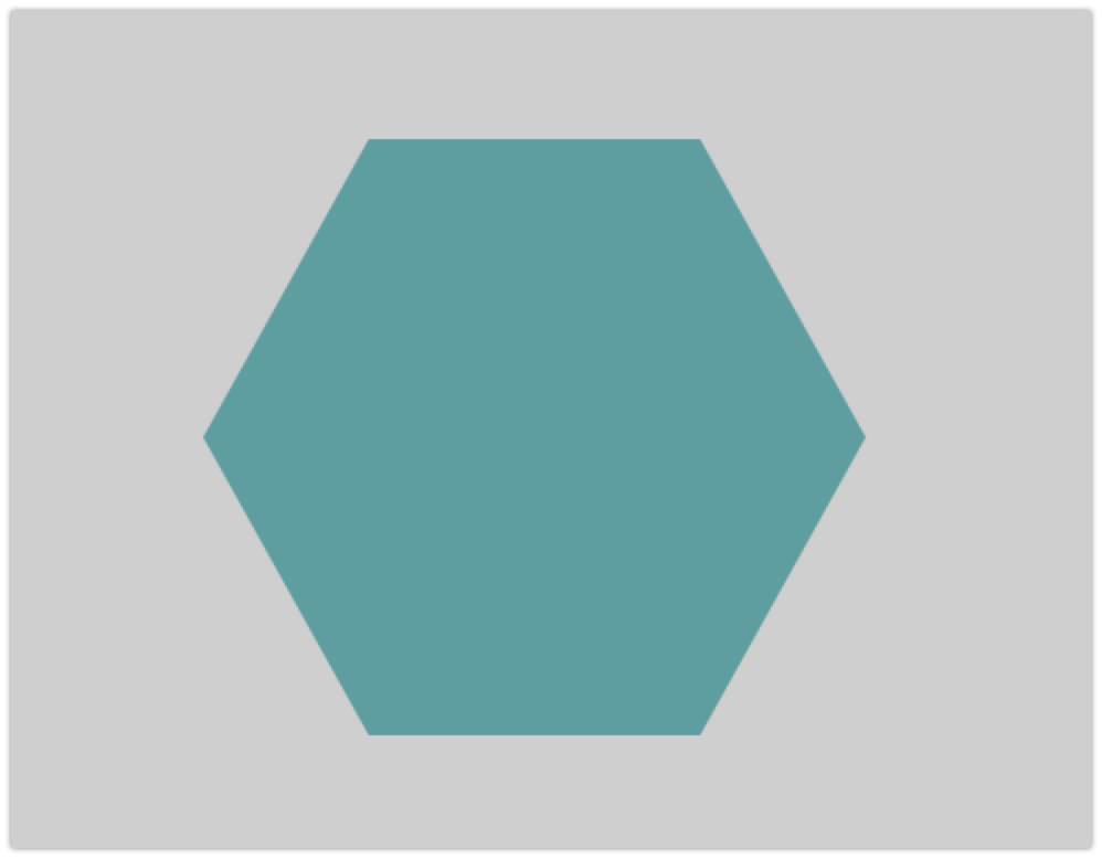
<div class="hexagon"></div>

.hexagon {
  width: 300px;
  height: 300px;
  background: cadetblue;
  -webkit-clip-path: polygon(25% 5%, 75% 5%, 100% 50%, 75% 95%, 25% 95%, 0% 50%);
  clip-path: polygon(25% 5%, 75% 5%, 100% 50%, 75% 95%, 25% 95%, 0% 50%);
}
This is how our hexagon looks like with above code
Hope you enjoyed reading this and learnt something new about CSS & Shapes. Infact, some of these tips can help you excel in css battles as well.
Written by Sachin Jain, Founder & CEO, Requestly. Sachin is a passionate web-developer who is building an open-source developer tool to make frontend developers more productive. On weekends, he reads book & learns new things. This article is one of the contributions of his weekend learnings.