Getting Started with CSS Battle
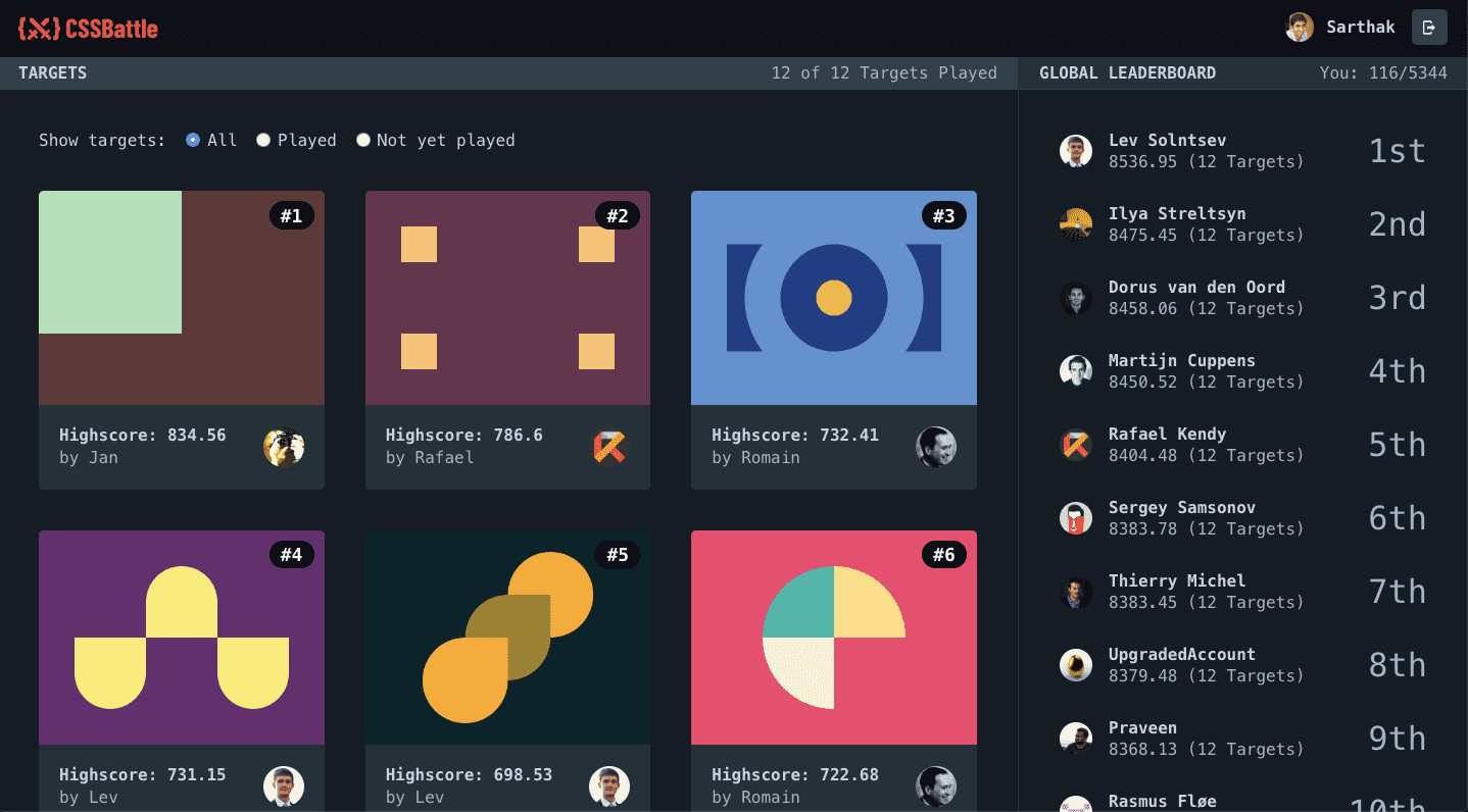
In a world plagued by CSS-in-JS vs SASS and “CSS in not a real language” tweet storms, comes a fun competitive game to park all discussions aside and flex your CSS muscles.
Made by @chinchang457 and @kushsolitary, CSS battle (https://cssbattle.dev) is a highly addictive game of CSS golf. It was launched less than a week ago on April 4, 2019 and there are already over 4000 players burning the midnight oil to scale the leaderboards.
How To Play #
There are 12 levels in CSS battle each with a target you have to replicate using HTML and CSS. Here’s what the first target looks like.
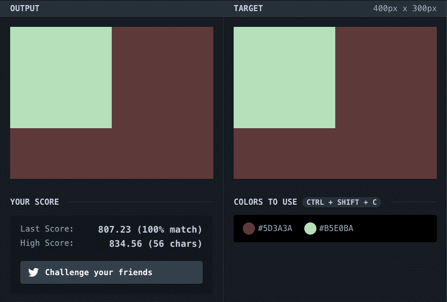
There are two simple goals:
- Write code to get a 100% visual match
- Find ways to reduce the character count of your solution.
There’s also global and level leaderboards you can view on the right to keep your competitive spirit up and provide signals as to what the optimal solution might be.

You can read more about how the game works in the FAQS.
In the rest of the article, I’ll be taking you on a walkthrough of the first target as an example to show you how to iteratively work your way through a target and reach the high score.
Spoiler Warning: Please do try it out on your own first. Just looking at the final solution takes the fun right out of it.
Target #1 - Naïve Solution #
Target #1 (Simply Sqaure) is visually just a pastel green box along with a brown background.
The default code written in the editor provides a half-baked solution to the problem. Let’s try and complete it.
Remember: Your first goal should always be to achieve a 100% visual match to the target.
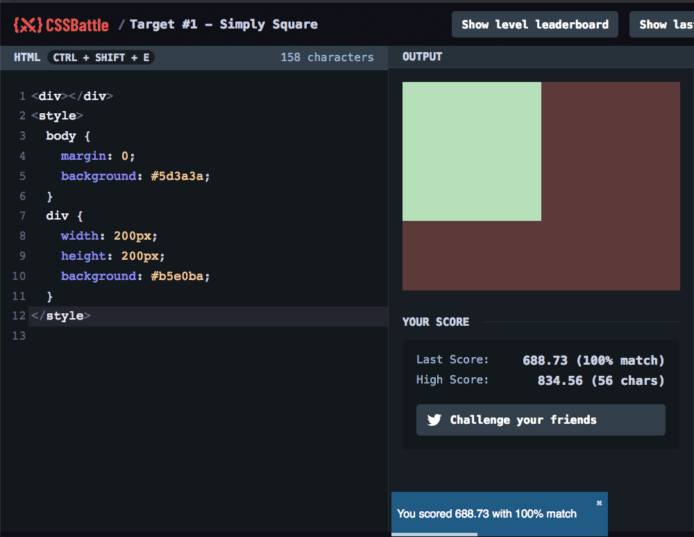
Using the following code, we match the target and get a score of 688.73. Our solution is simple enough.
<body> tags have a default margin of 8px in browsers and we had to accommodate for that. In most production code, you’d use a CSS reset so you never have to worry about it browser defaults/differences.
The other CSS properties are elementary for the solution.
<div></div>
<style>
  body {
    margin: 0;
    background: #5d3a3a;
  }
  div {
    width: 200px;
    height: 200px;
    background: #b5e0ba;
  }
</style>
But our solution is 158 characters long, about a 100 characters more than the top score with just 56 characters. Let’s see how we can improve out solution.
Optimizing your current solution #
The first thing to do after you get a 100% match is to get rid of the white-space.
You can use a CSS minifier to save you some time. Don’t use a normal minifier as it will make mistakes when it comes to certain CSS properties like border and box-shadow.
By removing all the spaces, we get the following code and we’re down to 107 characters.
<div></div><style>body{margin:0;background:#5d3a3a}div{width:200px;height:200px;background:#b5e0ba}</style>You’d notice how it removed the last semi-colon from each CSS declaration block. From the MDN docs:
The last declaration of a block doesn’t need to be terminated by a semi-colon, though it is often considered good style to do it as it prevents forgetting to add it when extending the block with another declaration.”
Time for some CSS Trickery #
Now comes the fun part.
Once you have an initial solution with white-space removed, you can work on improving your current solution to edge closer to the top score.
There are two things you’ve got to remember when looking for a better solution:
- Parser wrinkles and tricks: Each browser has its own inconsistencies and things it automatically fixes for us which we can exploit to cut down on characters. You’re actually recommended to exploit these.
- Optimizing vs Thinking anew: You can optimize your code by using syntax tricks but every once in a while you’ll need to re-think your approach to when you get stuck.
Let’s try to optimize our current solution first. Here’s our white-space removed code again:
<div></div><style>body{margin:0;background:#5d3a3a}div{width:200px;height:200px;background:#b5e0ba}</style>Some Tricks:
-
Since it’s an empty div we can just close it in the same tag.
<div></div>to<div/>
107 -> 102 characters (5 bytes saved) -
Remove the final style tag. Don’t worry, your browser will handle it.
102 -> 94 characters (8 bytes saved) -
Remove the px unit from width and height. It’s not required
94 -> 90 characters (4 bytes saved) -
Remove the final closing curly braces. Gotta trust your browser
90 -> 89 characters (1 byte saved) -
Replace the
<div/>with just<div>. Remember, you don’t always need to close things
89 -> 88 characters (1 byte saved) -
Replace the
<div>tag with a short block element<p>
88 -> 84 characters (4 bytes saved)
Our optimized solution now looks like this:
<p><style>body{margin:0;background:#5d3a3a}p{width:200;height:200;background:#b5e0baYou might notice how the parser on my blog stops highlighting it correctly.
So far so good. But the best solution is 56 characters and we’re only down to 84 characters. We’ve got to re-think our solution.
Re-think your solution #
Idea: What if we simplified the colors to 3 digits hex code. Well you can try it but it won’t work. It’s okay to try out things that don’t work. That’s the fun part!
Idea #2: What if there was no HTML?
Now that’s a more useful idea. Let’s assume for a moment that we didn’t write the <p> tag and saved 3 characters. What would we do then? Well, we could target the <html> and <body> tag.
This would work on the HTML front but targetting the <html> and <body> tag would increase the character count in the CSS declarations. What if we used the universal selector to shave off characters? Yes, that would work! Let’s do it.
We’ll use the universal selector * to target the html tag and *>* to target the body tag (as there are only two tags). The background applied to all elements by * is overridden in the body tag by *>*.
Again, you wouldn’t do this in your production code because the universal tag is really slow, but that’s the point of golf. It’s different from your day job.
<style>*{margin:0;background:#5d3a3a}*>*{width:200;height:200;background:#b5e0baOur solution is down to 80 characters and that’s the best we can get out of this approach.
Now, you could at any time head over to the forums and look for the optimal solution but I’d advise to use that as a last resort. For me, it sucks the joy right out of the game by copy-pasting the solution.
Idea #3: What if we removed the margin or width and height?
This may be a tough idea to come up on your own. You can look at your code in pieces to identity the spots where you can win some characters and places where you cannot. You cannot remove the background properties which take up a bulk of the characters. Nor can you remove the opening style tag. So perhaps there’ll be a solution where you can either remove the margin or the width and height.
Let’s see what happens when we remove the height and width and margin from the solution. We get this.
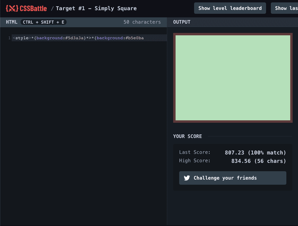
Doesn’t it look like two boxes? If we could find a way to restrict the size of the green box, our solution would work.
First, let’s align it to top right.
<style>*{background:#5d3a3a}*>*{margin:0 0 0 0;background:#b5e0baNow let’s use margin to push the box from the right and bottom
<style>*{background:#5d3a3a}*>*{margin:0 200 100 0;background:#b5e0baIt works and we’re down from 80 to 69 characters!
Side-note about browsers
When I was initially trying this on firefox, it wasn’t working so I had to switch to Chrome. At the time of writing, the CSS battle team recommends using Chrome as there are certain places you’d get stuck even though you have a “right” solution on other browsers.
We’ve got a good solution on our hands but looks like we’re still 13 characters away from the top score of 56.
Now this is the part where you go down the rabbit hole and spend hours trying to find the best solution.
It depends on the kind of person you are, but a pragmatic way forward would be to decide on a fixed duration for which you’ll look for a solution and if you don’t find it in that time period, you’d look at the solution in the forums.
This will help you avoid missing your sleep and/or work just to find the right answer because hey, at the end of the day, it’s just a sport! Don’t let the frustration on not getting to the top score get to you.
To be honest, I couldn’t get to the final score either. @PMJtweets from the team at Preflight pointed me to the right solution.
The best solution (so far) #
It may seem very counter intuitive but the best solution that’s been discovered so far uses box-shadow on the <img> tag to get the visual match.
Here’s the solution:
<img style="box-shadow:0 0 0 200px #b5e0ba,0 0 0 400px #5d3a3a" />This solution itself is 64 characters but you can optimize it by doing two things:
- Removing the quotes around the style attribute by using ”+” signs
- Replace the px unit with inch unit
Here’s what the final solution looks like
<img style="box-shadow:0+0+0+2in#b5e0ba,0+0+0+5in#5d3a3a" />Crazy right?
It works because 1. Box-shadow works on <img> as well and you can use multiple box shadows on a single element.
P.S. I did try replacing the <img> tag with the <a> but I assume since it’s an inline element, it would need width and height to display properly.
Your Turn #
As you can see, it can get pretty crazy here at CSS battle. And the tricks you use on one target can be re-applied on other levels too! So remember to go back on the other levels once you’ve learned a new trick. Who knows, you might even discover a new solution.
Spend enough time playing and you can officially call yourself a CSS-trickster.
This post was originally posted by Sarthak Batra on his personal blog.
